

M.H.K
-
Posts
22 -
Joined
-
Last visited
Content Type
Profiles
Forums
Downloads
Gallery
Posts posted by M.H.K
-
-
Hi
I'm trying to track an object and I wrote a program for it but it doesn't work perfectly and loses object.
I attached the program. Please help me.
Thank you in advance.
-
On 9/27/2016 at 2:22 AM, MikaelH said:
Hi MikaeIH and thank you very much.It's exactly my goal.
I will try your example and if I have a question, I will say you.
Thank you again.
-
8 hours ago, MikaelH said:
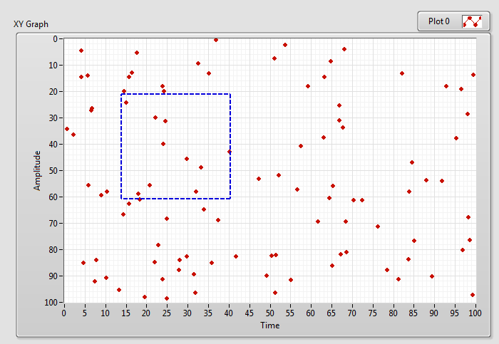
To be able to do this, you need to have every point as a one plot, and then you can use the PlotImage.Front property node to follow the mouse to draw a ROI on the graph, and then find the plots-points that are within the ROI and change the Color of those plots.
It might be easier to use a Picture Control Plot to start with.
Hi MikaeIH and thanks for your reply.
I have a question about your help.
How Can I draw a ROI in xy graph?
-
Hi
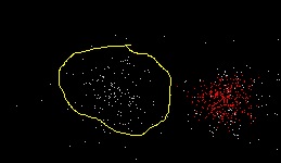
I have a xy graph contains a number of points and I want to select a part of them similar to ROI and their colors be changed and also, we can select a number of ROI in that.
please help me.
-
I dont want to change the color.I want to have a graph with a color without changing it.I prepare the graph for a color but after reducing the number of plot and then increasing them,color change.
-
Hi
I want to have a graph with a number of plot ( such as 500 ) without changing color ( with a fix color ).
In Labview,when you set a graph with 500 plot in a color and after that you reduce the number of plot and again to 500 plot,color change.
How can I have a graph with a color?
Thank you -
1 hour ago, ensegre said:
What I'm led to understand is that the OP wants to emulate this: http://www.plexon.com/products/omniplex-software. I presume that various spike templates are drawn at hand with a node tool (more than just one threshold), and that the computational engine does statistical classification of all what is identified as a spike event in the vast stream of incoming electrophysiological data. Classification could label, say, each spike according to the one among the templates which comes closest in rms sense, but PCA may be more sound.
Now we are at the level of "how to plot many colored curves". At some point we'll be at "how to draw a polyline with draggable nodes", then "how to compute PCA of a 2D array"... Or?
 ,I have made this hardware for my laboratory and now I am trying to write its software with your help.
-
1 hour ago, bbean said:
how many points are in each plot of graphs you shown in your last post? 8192 or 30-50
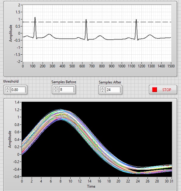
First,I receive my datas from DAQ with 8192 points, then I detect their picks and show 8 samples of before peak and 24 samples of after peak.
So, I want to show at least 32 sample,not 8192
2 hours ago, bbean said:Is the template trace pre-calculated before starting or is it an average of some set of the white traces (exceeding some threshold)? I guess I'm asking if you have multiple different thresholds for each color shown in the graphs?
It is RMS of some set of the white traces.But we have a threshold with several templates that each of them shows firing of a neuron.
-
40 minutes ago, bbean said:
I'm a little confused. On your first post you show code and an example where you do a peak detection and than pop off traces from the data around those points (samples before and after). Is that all you need to do?
It was my first problem, and it is may goal :
40 minutes ago, bbean said:Or do you need to do additional post processing on the samples before and after the peaks (analyze each set of data around the peaks). For example in the post with these screenshots:
-----------------------------------------------------------------------------------------------------------------------------------------------------------------------------
40 minutes ago, bbean said:you show another threshold line. Is there a second post processing step (on the traces that were pop'd off of the original signal) that you want to do "online" with another threshold?
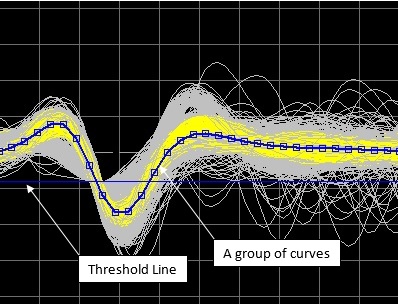
what do you mean ? I have a threshold line that show on plot.

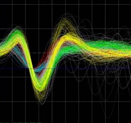
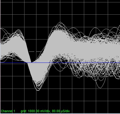
In this picture,we have all of curves ( white ),a group of curves ( yellow ),a template curve ( blue that it is template of yellow curves ), and a threshold line ( blue ).
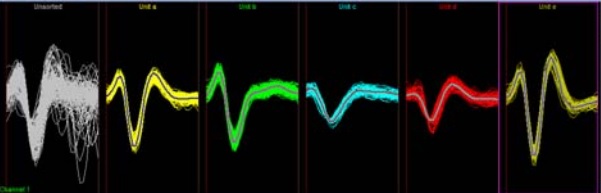
And in this picture,all of curves have sorted in 5 templates that they show in different plots that the main graph contains all of them is:
It maybe contains with templates curves or not that in this templates curves are hide.
-
47 minutes ago, bbean said:
Changing the colors of individual plots occurs in the UI thread and is "expensive"
53 minutes ago, bbean said:if you change your threshold value, do you want to remove the old yellow traces from the display if they no longer meet the threshold criteria?
Yes,they will display until meet the threshold criteria,as template curve has such condition.
59 minutes ago, bbean said:how long does the daq read take, you should explore pipelining to help speed up things as well. In the link A would be your DAQ and B would be your update of the buffer and display
in my daq,FIFO size is 1024,and I read 8192 samples each time.
1 hour ago, bbean said:You make an exact copy of the graph and then use the tools pallette paintbrush, switch the color to transparent T, start erasing things on the graph that aren't needed (everything except the signal plots for the most part), and then move that graph over top of the other graph. Some ppl will call this a "cluge" and you have to make sure that if the x or y scale change on the visible graph, it also changes on the transparent graph. So programming challenges arise for instance if you allow the user to autoscale.
I have to test it and I will say you its result.
-
Hello
20 hours ago, ShaunR said:Isn't the issue that the OP is referring to, that when large data amounts are sent to the graph (regardless of how they were acquired or organised) that the indicator is slow at rendering them? Yes. Ring buffers are great for recording data at high rates but you are still left with the rendering problem, are you not?
I think the OPs issue becomes a little clearer if you make your 500 plots 8192 data points in length instead of 128
")
It is good point.
First,I wanted to overlay all of them,but ensegre convinced me that I limited their numbers.
anyway,if you have a good idea,i will be happy to hear it.
19 hours ago, bbean said:Maybe pipe-lining would help here.
Can you explain more?
19 hours ago, bbean said:Option 2 - decimate the data for display
I cannot use of way of "decimate the data for display".because I only have 30-50 data points for each of overlaid curves .you can see it and its source code in first post.
-
Hello
23 hours ago, bbean said:I think you will have to create two ring buffers and two graphs, one for displaying realtime data, and another for displaying your "selected plots", then make one graph transparent and overlay it over the other
Thank you for your reply.
For this,Why should not I change their colors?
And,how should I implement this "transparency"?
21 hours ago, ensegre said:"mine is faster..."


Thank you, Is so good.
But,why do you use of visible property and bbean use of defer panel updates?Which one is faster?
20 hours ago, ensegre said:If it helps
Thank you so much
-
I think,I set it wrong.
5 hours ago, mohamad said:But I have a question: If I want to show 1000 recent curves,which way I have to use?
By that I mean,I decided that 1000 Curves is always displayed and after plotting 1001st, the first curve is removed and it is always repeated.
It is also about waveform graph.
I am sorry.
-
Hello ensegre
Those questions that I asked you, were about waveform graph.
5 hours ago, mohamad said:How many curves LV graph widget is able to plot without slowing
5 hours ago, mohamad said:But I have a question: If I want to show 1000 recent curves,which way I have to use?
By that I mean,I decided that 1000 Curves is always displayed and after plotting 1001st, the first curve is removed and it is always repeated.
Have you an idea about it?
Thank you
-
Hello ensegre
Thank you for your reply and I am sorry for the late reply.
On 6/20/2016 at 10:55 AM, ensegre said:I have somehow the impression that you're assuming that there should be some magic option of the LV plot widget as is, which saves from application design. What you show about hand drawing a template curve, and classifying traces, hints that there is more computation going on behind the scenes. The display in the plot window must be a somewhat sophisticated GUI, only giving the user a feeling of what data is been accumulated and how to interact with it, quite likely not doing the mistake of replotting the whole dataset for every new curve acquired (that would be expensive). The right question might be whether you can use the LV graph widget for what it gives, or rather the picture widget as Shaun suggested above (that would overplot directly to the pixmap, I guess, and be significantly faster), as a starting point for building such a GUI. The LV graph widget, optimized as it may be, is slow because it is complex: it handles autoscaling, abitrary number of curves, arbitrary plotting stiles, filling and whatnot, and this comes with a price. Someone may correct me, but I don't even think it can handle adding incrementally new curves, without replotting the whole bunch.
You have convinced me.
I have 16 channel of analog input and I have to plot them,so I use to picture widget ( Shaun's suggestion ) for all of them and only, I plot one of them with LV graph widget.
But I have a question : How many curves LV graph widget is able to plot without slowing?
On 6/20/2016 at 10:55 AM, ensegre said:If I would have to build something the like, I would store the data in memory appropriately and without connection to the graph; I would consider to update that display only periodically, fast enough to give the user a feeling of interactivity, and track user clicks on the graph area in order to replot the data with the right highlights, to give the user the impression s/he is playing with it.
It is a good idea and I think about it.
But I have a question: If I want to show 1000 recent curves,which way I have to use?
By that I mean,I decided that 1000 Curves is always displayed and after plotting 1001st, the first curve is removed and it is always repeated.
Have you an idea for it?
Thank you
-
Hello JKSH
Thank you for your reply and I am sorry for the late reply.
On 6/20/2016 at 9:46 AM, JKSH said:Could you collect all your data first, and then plot them afterwards?
Actually,no.
Because, Those curves have to see for deciding about sorting them.
On 6/20/2016 at 9:46 AM, JKSH said:Out of curiosity, what is the name of this other app?
Its name is OmniPlex and you can download its demo from this link:
http://www.plexon.com/sites/default/files/OmniPlexDemoV1Setup.zip
It is a software about online spike sorting for neuroscience research.
On 6/20/2016 at 9:46 AM, JKSH said:It's possible that your other app was especially designed and optimized for one specific use-case (visualizing a huge number of ECG graphs). LabVIEW graphs are general-purpose and very flexible, so it can be out-performed by a single-purpose, less flexible graphing tool.
In my opinion,Labview is able to do it, but it need to more study.
Thank you
-
Hello ensegre
Thank you for your reply and I am sorry for the late reply.
On 6/19/2016 at 0:37 AM, ensegre said:Instead of trying to plot 5000 curves at every iteration of the loop, you could try maintaining a different loop plotting, at lower rate, the most recent N, with N suitably large
I cannot bring rate down and cannot separate these two cases from each other.of course, it should not be impossible,because I have already saw this feature in another app :
In this,both threshold line changes curves situation online, and you can select a group of curves online for subsequent analysis.
On 6/19/2016 at 0:37 AM, ensegre said:is using an intensity plot to display a 2D histogram
It is a good suggestion, but I have to access to each of curves for selecting them and sorting them to different categories based on template, similar this:

If I use of intensity plot, I cannot analyze them later.
Do you think, it is possible to overlay curves without harming any of them?
Have you an idea?
Thank you
-
hello ShaunR
Thank you for your reply.
1 hour ago, ShaunR said:The speed maybe more to do with the for loop to create the array than the plot itself
If I disable plot it can overlay without finitude. But I need to displaying them.
1 hour ago, ShaunR said:Then you wouldn't have to manipulate the 2D array.
I need to manipulate data,and I must select each of overlaid plots later.
So,my suggestion is not good.
Have you an idea for overlaying too many plot without slowing?
Thank you
-
On 6/17/2016 at 4:37 AM, JKSH said:
That's normal, because plotting 5000 graphs requires lots of computing resources.
May I ask why you want to plot so many overlays at the same time? After all, it's very difficult to see them.
hello JKSH
thanks for your reply.
It is true,but I need to overlay many plots,it is a technique for neuroscience research ( Spike Detecting ),I saw this feature in other application without slowing:
It is 100000 overlay!
I think,if we do not copy all of data,it is possible.
It is mean that if we hold all of plots and only overlay recent plot,it is possible.
Have you an idea?
Thank you
19 hours ago, Nagaraj Hc said:Turn off synchronous display if it is already enabled, this will save some time but graph updates at lower rate compared based on UI thread availability. I don't why you want to overlay above 5000 plots, instead we should try different representations
Hello Nagaraj Hc
Thank you for your reply.
synchronous display has been off. I explain about your comment in above ( reply of JKSH ).
Have you an idea?
Thank you
15 hours ago, Wouter said:If you want to know if your data is within population I think it would be best to simply calculate the mean, mean + 3*std and mean - 3std of all datasets and plot those along with your new dataset.
Hello Wouter
Thank you for your reply.
It is not true,because I need to all of data and after that I have to do many calculations over these plots.such as: peak & trough figure,energy figure,PCA figure,spike sorting and etc.
I explain about my goal in above ( reply of JKSH ).
Have you an idea?
Thank you
-
Hello,
I am writing a program for overlapping.
But after about 5000 of overlay,it begin to slow.
Could you help me?
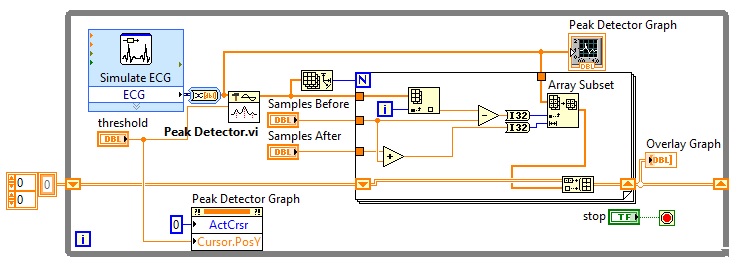
I attached vi,front panel picture and block diagram picture.
(for simulation, I used Biomedical Toolkit)
Thank you
Create inf driver
in LabVIEW General
Posted
Hello
I have a .inf file as my instrument driver but I cannot modify it for Win8.1 and Win10. It generate with NI-VISA Driver Development Wizard version 5.3.
Can everyone help me?
Thank you in advance.
opbox20f.inf