Aristos Queue Posted October 28, 2011 Report Share Posted October 28, 2011 PS> haven't been keeping up the score; it's a low two digit number to a mere 3.5 unicorns. A bit of history here... when the icon FP Terminals were first added, I didn't like them and asked they be removed because all they did was reflect a few FP controls/indicators. Those who do the usability testing on LV said that it benefited newbies to recognize the association between the thing they dropped on the panel and the thing they dropped on the diagram. I sighed and said, well, if we're going to have icons, they might as well be *useful* icons, so I made the VI Refnum reflect conpane, made the other refnum types show something other than just the folded corner of paper, made the typedefs show their control icon, and made LV classes show their type icon (originally they were all cubes). And then, as time went by, they started growing on me.Maybe it's just prisoner syndrome and I've started identifying with my captors. Quote Link to comment
K-node Posted October 28, 2011 Report Share Posted October 28, 2011 (edited) Here are some of my "Feelings on Icons for Terminals"... , I could not resist! Have a great weekend! EDIT: Damn my employer, they lock down almost all internet capabilities. png's did not upload. I will try from home later. Edited October 28, 2011 by kugr Quote Link to comment
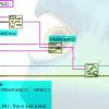
Grampa_of_Oliva_n_Eden Posted October 28, 2011 Report Share Posted October 28, 2011 An experiment. My previous subVI redone to be more like ShaunR's style: That is close to my style as well (exception: I avoid wiring through the top/bottom of structures since it is not well defined if those tunnels are input or output) but the point I want to highlight now is the label allignments. It would be nice if the labels of source are to the left and outputs on the right. Ben Quote Link to comment
drjdpowell Posted October 28, 2011 Author Report Share Posted October 28, 2011 exception: I avoid wiring through the top/bottom of structures since it is not well defined if those tunnels are input or output I prefer that a subVI's terminal layout roughly matches its connector pane. So in the example, "ObserverRegistry in" is on the top because it connects to the top of the subVI. In contrast, with ShaunR's example I can't tell where his seven inputs connect. If you deselect view subVI as icon and drag down the nodes so it looks like a bundle by name or more accurately like an express VI. How many people knew you have the option NOT to view a VI as an icon? Does anyone do that? I recall in the past considering displaying a VI like this, either because it was a key VI that I wished would stand out, or it just had so many inputs/outputs that it would look like spider otherwise. Can't recall if I actually used it, but in principle it is very similar to bundle-by-name or property nodes, and like them is somewhat "auto-documenting". However, like Paul, I currently find I don't have that many input/outputs in any one subVI, and they are all pretty clear, due to the nature of LVOOP-style programming. Quote Link to comment
Darin Posted October 28, 2011 Report Share Posted October 28, 2011 It's Friday, so what the heck? Without taking up that much more space (in most cases) than the icon view you can give me some really useful information and capabilities on the BD. Certainly clears up the FP/BD relationship. I would use this in a lot of subVIs and totally bag the FP. Drop an indicator, choose the Control view and forget about probes. 2 Quote Link to comment
asbo Posted October 28, 2011 Report Share Posted October 28, 2011 That is close to my style as well (exception: I avoid wiring through the top/bottom of structures since it is not well defined if those tunnels are input or output) but the point I want to highlight now is the label allignments. It would be nice if the labels of source are to the left and outputs on the right. I tend to following both of these practices, though occasionally I'll break the top/bottom rule if the input isn't used some ways into the VI, somewhere off the first screen of the BD. This tends to happen with CLN- or property-node-heavy code. I prefer that a subVI's terminal layout roughly matches its connector pane. So in the example, "ObserverRegistry in" is on the top because it connects to the top of the subVI. In contrast, with ShaunR's example I can't tell where his seven inputs connect. I used to think this way, but I abandon it not long after starting LabVIEW. The front panel is for matching the conpane, the BD is to organize whatever makes the most sense. Sometimes that ends up matching the conpane, but usually only in simple VIs. 1 Quote Link to comment
Daklu Posted October 28, 2011 Report Share Posted October 28, 2011 In contrast, with ShaunR's example I can't tell where his seven inputs connect. Uhh... that's a block diagram. Why do you *care* where they connect? I prefer that a subVI's terminal layout roughly matches its connector pane. So in the example, "ObserverRegistry in" is on the top because it connects to the top of the subVI. I remember posts on the dark side suggesting matching the general location of a terminal on the bd, fp, and connector pane was "good style." I tried it for a while but it got to be a pain rearranging all my wires and block diagram if I changed a conpane terminal connection. I'll try to put fp controls in the same general location as the conpane terminals, but I don't worry about matching the block diagram terminals. I'll put them wherever they need to be to make a clear block diagram. Personally I think most style debates are much ado about nothing. The goal is code clarity, not style for the sake of style. There are lots of ways to write clear code and communicate intent. We're "advanced" developers, right? I'll leave the style gestapo for the dark side. (Not suggesting anyone here is being part of the style gestapo... writing this brought back memories of numerous style debates with developers.) 1 Quote Link to comment
LogMAN Posted October 28, 2011 Report Share Posted October 28, 2011 Do you mean "select the terminals" and the little pull-down menu of alignment options? Exactly. I agree, selecting pull-down menu takes time, but as I get used to it over time it goes faster and faster. Also you just need to do this like two or three times a hour after adding new controls / indicator (as I write programs). I did a little CAD work back in the day and I've always found the LabVIEW alignment tools to be slow and clunky. A relatively simple "snap to guidelines" feature (aligning in both dimensions to related objects and also aligning for straight wires) would make it easy to write code clean from the start. I frequently use CAD application too, but I always liked the way LabVIEW does not automatically snap in position. actually it does make some things easier for me (on large VIs with many wires). Best solution might lie in between (like turn on / off snap positions by hot-key). I can't say I care that much about the standard types either way. A string is a string. But mixing icons and smaller types means I have to go through the effort of manually changing either the standard or non-standard types. And in larger diagrams, with only a few controls/indicators, I don't see much benefit to the smaller terminals, even for standard types. But I'd be happy to meet people half way if we all want to standardize on small terminals for simple types and icons for objects, type-def clusters and enums, refnums, or anything where the small terminal doesn't convey the full type. I disagree if it comes to mixing everything up, since this would make a VI even more unreadable. How about adding a tool where you can design your own control / indicator symbol of a cluster / class or any complex type? ...(That would possibly make things even more complex......) Flipping back and forth between BD and FP just to figure out what the terminals are? Can't say I like that option for code clarity! I agree, flipping between BD and FP is not a solution. In my opinion, if you even need to switch between BD and FP, your VI got to large and you should consider using SubVIs. But using large icons does not solve this problem too, since they also do not show all information about your type. So what I usually do is using the help window while programming large solutions on classes or other object related projects (It will tell you more as you could possibly show on any icon). A bit of history here... when the icon FP Terminals were first added, I didn't like them and asked they be removed because all they did was reflect a few FP controls/indicators. Those who do the usability testing on LV said that it benefited newbies to recognize the association between the thing they dropped on the panel and the thing they dropped on the diagram. I sighed and said, well, if we're going to have icons, they might as well be *useful* icons, so I made the VI Refnum reflect conpane, made the other refnum types show something other than just the folded corner of paper, made the typedefs show their control icon, and made LV classes show their type icon (originally they were all cubes). And then, as time went by, they started growing on me. Maybe it's just prisoner syndrome and I've started identifying with my captors. sense of humor at the end? Let me say just this: Thanks for adding large icons, they helped me a lot when I started programming in LabVIEW. Thanks for letting me choose between large and small icons, I really appreciate this. Whether my VI benefit from small icons or not depends on my particular VI and my specific way of programming. I suppose a bad programmers VI will be unreadable no matter which icon he or she uses, am I right? If you want to know something about your VIs readability, just open a VI you wrote one or two years ago! Just got thinking: Maybe we are running in circles on LabVIEW, like when you are beginner, you use large icons, at some point you switch to small icons and when you are professional you might switch back to large icons... I'm pretty shure there has been a similar singularity here on LavaG. 1 Quote Link to comment
drjdpowell Posted October 28, 2011 Author Report Share Posted October 28, 2011 I frequently use CAD application too, but I always liked the way LabVIEW does not automatically snap in position. actually it does make some things easier for me (on large VIs with many wires). Best solution might lie in between (like turn on / off snap positions by hot-key). I've been thinking of posting simple CAD-lite guides as an Idea on NI.com. I think it could work well as long as it is kept simple. Like snap in position only for: 1) eliminating a wire kink. 2) aligning a control/indicator to another control/indicator, regardless of distance between them (possibly include constants and control references) 3) align all BD items, but only to other items that are nearby (to reduce the number of snap-to points which would be far too large otherwise) Maybe even just do (1) and (2), since most subVI/primitive alignment involves eliminating wire bends anyway. The "snap-to" range should only be a few pixels (less than the snap-to range currently used in aligning labels). Keeping the feature quite limited will make it very intuitive and easy to use. -- James Quote Link to comment
drjdpowell Posted October 29, 2011 Author Report Share Posted October 29, 2011 The front panel is for matching the conpane, the BD is to organize whatever makes the most sense. Sometimes that ends up matching the conpane, but usually only in simple VIs. Uhh... that's a block diagram. Why do you *care* where they connect? I like the visual connection between block diagram, front panel, and subVI connections. They are different facets of the same entity. Note that most of my LVOOP subVIs are both quite simple and have relationships with multiple other subVIs. Other methods in the same class will have matching connections for the object and error terminals; override VIs in related classes will match all connections. Mimicking these relationships visually on the block diagram is helpful (particularly as LVOOP means you have a lot of related subVIs). I remember posts on the dark side suggesting matching the general location of a terminal on the bd, fp, and connector pane was "good style." I tried it for a while but it got to be a pain rearranging all my wires and block diagram if I changed a conpane terminal connection. I'll try to put fp controls in the same general location as the conpane terminals, but I don't worry about matching the block diagram terminals. I'll put them wherever they need to be to make a clear block diagram. I'll make exceptions to the pattern if it doesn't flow naturally into the code. But find I seldom need to do any rearranging. I try and design conpane locations for a class before doing much coding, so I seldom change a terminal connection (changing the conpane on several dynamically-dispatched versions of the same subVI is a real pain). And with small subVIs, with not that many inputs (as Paul pointed out), there is less need for careful organizing. Connector pane locations also carry information to me: top left and top right terminals are the "subject" of the subVI (a relationship formalized in LVOOP, but common in other LabVIEW APIs); bottom left and right is the error cluster (OK, duh); remaining two left inputs are...uh..."consumed parameters" of the method; left two are "results returned". Top and bottom connections are for options, or things need to perform the action that are in some way... "independent" of it. So, to me, the "Observer Registry" input of my example naturally goes on a top input of the "Receive..." VI, not in the front. Hmm, OK, maybe it's just that my brain is wired funny. Personally I think most style debates are much ado about nothing. The goal is code clarity, not style for the sake of style. There are lots of ways to write clear code and communicate intent. We're "advanced" developers, right? True. I was motivated to start this conversation by reading an idea to eliminate nearly all customization of terminals; not just icon/no-icon, but the ability to place the label in different locations, in order to standardize how things are done. I don't think this is necessarily desirable, even if the standard to be chosen were my own. -- James Quote Link to comment
Daklu Posted October 29, 2011 Report Share Posted October 29, 2011 I'll make exceptions to the pattern if it doesn't flow naturally into the code. Fair enough. A consistent conpane can go a long ways towards making a class' api user friendly, and on my block diagrams the object terminals are usually near the top and the error terminals are usually near the bottom. Beyond that it all depends on where the wires connect to the sub vis. But find I seldom need to do any rearranging... so I seldom change a terminal connection. Usually what happened is I'd change the block diagram layout and I'd have to go back and rearrange the front panel... followed by the conpane. (Yeah, that particular "best practice" didn't last for long.) changing the conpane on several dynamically-dispatched versions of the same subVI is a real pain This comment got me wondering... Maybe 10% of my app-specific classes use dynamic dispatching to provide the application's functionality. What's the going rate for others? Quote Link to comment
drjdpowell Posted October 31, 2011 Author Report Share Posted October 31, 2011 This comment got me wondering... Maybe 10% of my app-specific classes use dynamic dispatching to provide the application's functionality. What's the going rate for others? I've only been using OOP inheritance for less than two years, and my job has never been more than 30% programming, so I don't have meaningful statistics. But I have had one program that involves look-up and display of data records from seven very different measurements from a database. This led to a complex "Record" class with seven children. I also developed my messaging design for this project; it has seven "Plot" actors to display the datasets of the seven record types in a subpanel. Making a matching change in seven subVIs (actually eight, including the parent) is a pain, regardless of what the change is. It only takes one project to learn that lesson. -- James Quote Link to comment
LogMAN Posted November 2, 2011 Report Share Posted November 2, 2011 I've been thinking of posting simple CAD-lite guides as an Idea on NI.com. I think it could work well as long as it is kept simple. Like snap in position only for: 1) eliminating a wire kink. 2) aligning a control/indicator to another control/indicator, regardless of distance between them (possibly include constants and control references) 3) align all BD items, but only to other items that are nearby (to reduce the number of snap-to points which would be far too large otherwise) Maybe even just do (1) and (2), since most subVI/primitive alignment involves eliminating wire bends anyway. The "snap-to" range should only be a few pixels (less than the snap-to range currently used in aligning labels). Keeping the feature quite limited will make it very intuitive and easy to use. -- James I know it's slightly off topic, however: 1) Most wire kink are caused by terminals not fitting together (like I want to connect 2 input terminals / constants to one 4-2-2-4 Sub-VI). I actually want my wires to kink in a specific, readable way. I can only imagine using such a solution to align my input - output terminals (like error in - error out) together. But I can actually do this by two clicks, so this solution would save a couple of clicks. However, it would allow more easy programming if I can switch it on / off. 2) We can actually do this by using the alignment tools as I wrote on 1) if you select both terminals before. If this is done automatically it will cause headache on my side, since I don't want all my controls to fit together. 3) I think this would be interesting in a way like Microsoft (I know, bad word ) does it in their Form designer. I think this subject worth it's own thread (Maybe already existing... ). Greetings, LogMAN Quote Link to comment
BrentonLang Posted November 2, 2011 Report Share Posted November 2, 2011 WOW, this is a hot topic. I may as well add my two cents worth. I much prefer small terminals, not icons. Mainly because you can position them much closer, and it keeps the block diagram much neater. I think NI use Icon terminals by default, for beginners or amateurs of LabVIEW. ie. People who may not know the data types too well. 1 Quote Link to comment
drjdpowell Posted November 2, 2011 Author Report Share Posted November 2, 2011 I actually want my wires to kink in a specific, readable way. The feature I'm imagining will only snap to a possible position when it is within a couple of pixels. This should be small enough that is will act to help the programmer align things exactly as he/she wants. So, if you want the tops of subVIs to line up instead of straight wires then no problem. Want bend the wires in a readable way, no problem. Basically, you place the item where you want and the program helps with the micro-positioning. We can actually do this by using the alignment tools as I wrote on 1) if you select both terminals before. If this is done automatically it will cause headache on my side, since I don't want all my controls to fit together. You would have to place the terminal within two pixels of aligned to trigger the snap-to; nothing is forced on the programmer. Now, if you actually wanted the terminal one or two pixels off alignment with another, you would need to hit the arrow key once or twice. Hopefully, such situations will be rare. If not, there would be the ability (including a hot key) to turn the feature on/off. Unfortunately, it's hard to verbally communicate the advantages of CAD-like guides. -- James 1 Quote Link to comment
Wire Warrior Posted November 2, 2011 Report Share Posted November 2, 2011 I prefer not to use the terminal icons. They are large and I have to double check they are not a VI especially when reviewing someone else's code. Of course, I have to admit that I did come to use the environment options more after they appeared because the first thing I did was open it and turn them off, which led me to examine other options. Jason Quote Link to comment
Aristos Queue Posted November 2, 2011 Report Share Posted November 2, 2011 because the first thing I did was open it and turn them off, which led me to examine other options. *laugh* Can I add that to the list of advantages from large icons for new users? :-) 1 Quote Link to comment
Wire Warrior Posted November 2, 2011 Report Share Posted November 2, 2011 LOL...I suppose you can Aristos. Never thought of that as a feature. Jason Quote Link to comment
drjdpowell Posted November 4, 2011 Author Report Share Posted November 4, 2011 (edited) Final score: Small terminals: 23.5 votes (that includes the "mostly-no"s, the "no"s and the "HELL, NO"s). Icons: 4.5 votes. -- James Edited November 4, 2011 by drjdpowell Quote Link to comment
Jordan Kuehn Posted November 4, 2011 Report Share Posted November 4, 2011 I don't know if you counted me. If not, make that 24.5 Quote Link to comment
drjdpowell Posted November 4, 2011 Author Report Share Posted November 4, 2011 24.5, then. Actually, looking at the "Like"s from those who didn't post strongly suggests 4 additional votes for small terminals. So that makes it 28.5 to 4.5. -- James Quote Link to comment
Daklu Posted November 4, 2011 Report Share Posted November 4, 2011 Democracy is two wolves and a sheep deciding what's for dinner. So that makes it 28.5 to 4.5. Good thing NI isn't a democracy. 1 Quote Link to comment
hooovahh Posted November 10, 2011 Report Share Posted November 10, 2011 Good thing NI isn't a democracy. While I agree NI isn't a democracy, they do have to cater to their customers and adding or removing features that the majority are asking for (mostly adding) is what keeps customers buying and using LabVIEW, which keeps customers buying hardware. I think it is in NI's best interest to add features that are asked for by the most number of users. Which is why the idea exchange seems to work well for feature requests in LabVIEW. Now that's not saying that some features haven't been added in the past which a minority has asked for (or even no one). I can think of several features of LabVIEW that must have taken alot of hours to implement which I've rarely used, and I would have preferred those hours been used on some other feature I wanted, but I'm just one customer. Quote Link to comment
ShaunR Posted November 10, 2011 Report Share Posted November 10, 2011 While I agree NI isn't a democracy, they do have to cater to their customers and adding or removing features that the majority are asking for (mostly adding) is what keeps customers buying and using LabVIEW, which keeps customers buying hardware. Nope. It's obsolescence and having to upgrade to get bug fixes that keeps people buying Labview. Quote Link to comment
The Q Posted November 16, 2011 Report Share Posted November 16, 2011 I like smaller on my block diagrams. The same goes for the smaller boolean and cluster constants as well. Quote Link to comment

Recommended Posts
Join the conversation
You can post now and register later. If you have an account, sign in now to post with your account.