

ChinaOliver
-
Posts
2 -
Joined
-
Last visited
Content Type
Profiles
Forums
Downloads
Gallery
Posts posted by ChinaOliver
-
-
Has anyone ever been in this situation? When the data is displayed on the XY graph, the Y-axis scale is inconsistent with the actual data.
However, the data exported through the XY chart menu "export data to excel" is consistent with the actual data.
That's a very strange question. Can someone tell us the root cause? Thank you very much.Using LabVIEW 2020 Professional Edition
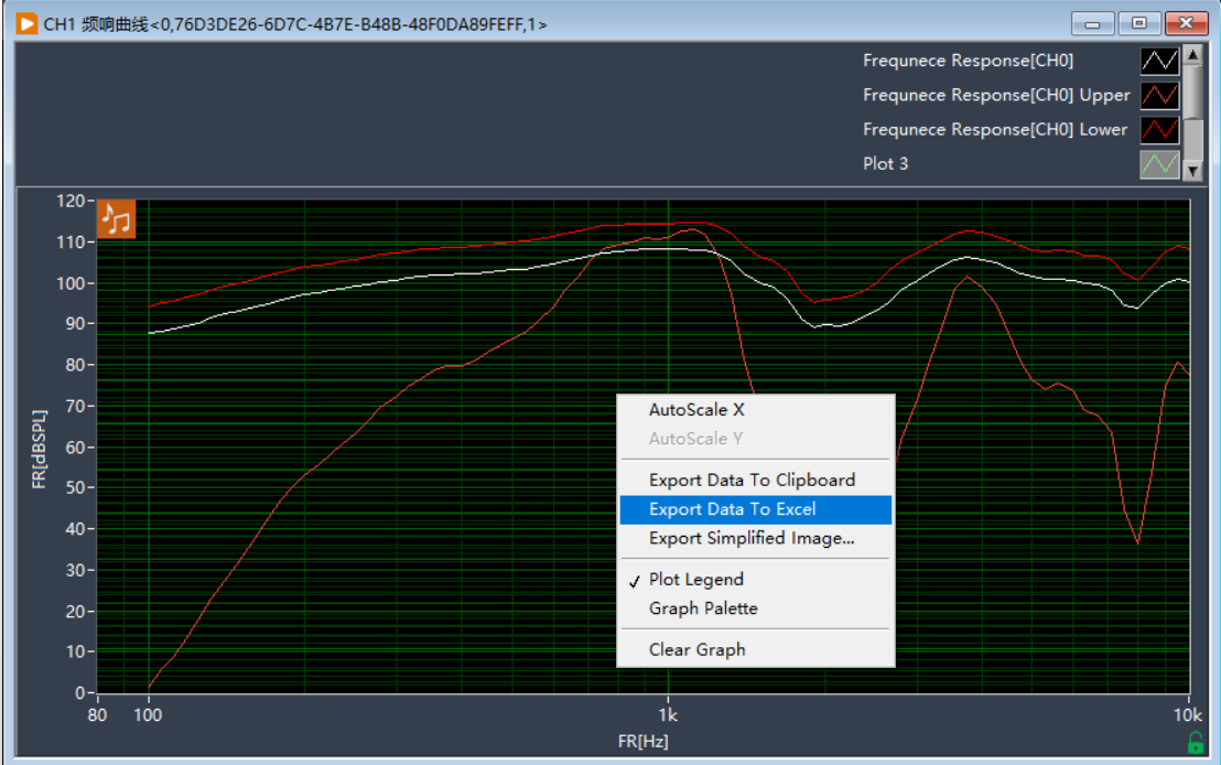
The curve shown in the XY graph is inconsistent with the actual data
in LabVIEW General
Posted
I checked the Y scale, and you were right. But this problem is really troubling, because the same display window shows that other curves are normal, only the attached curve is abnormal. Try to set each curve to correspond to the Y scale, this problem can be solved. Have a nice day.😀