

hova2010
-
Posts
31 -
Joined
-
Last visited
Content Type
Profiles
Forums
Downloads
Gallery
Posts posted by hova2010
-
-
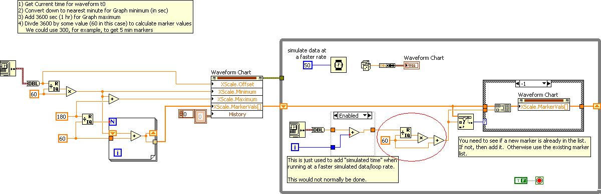
2 Questions Scott:
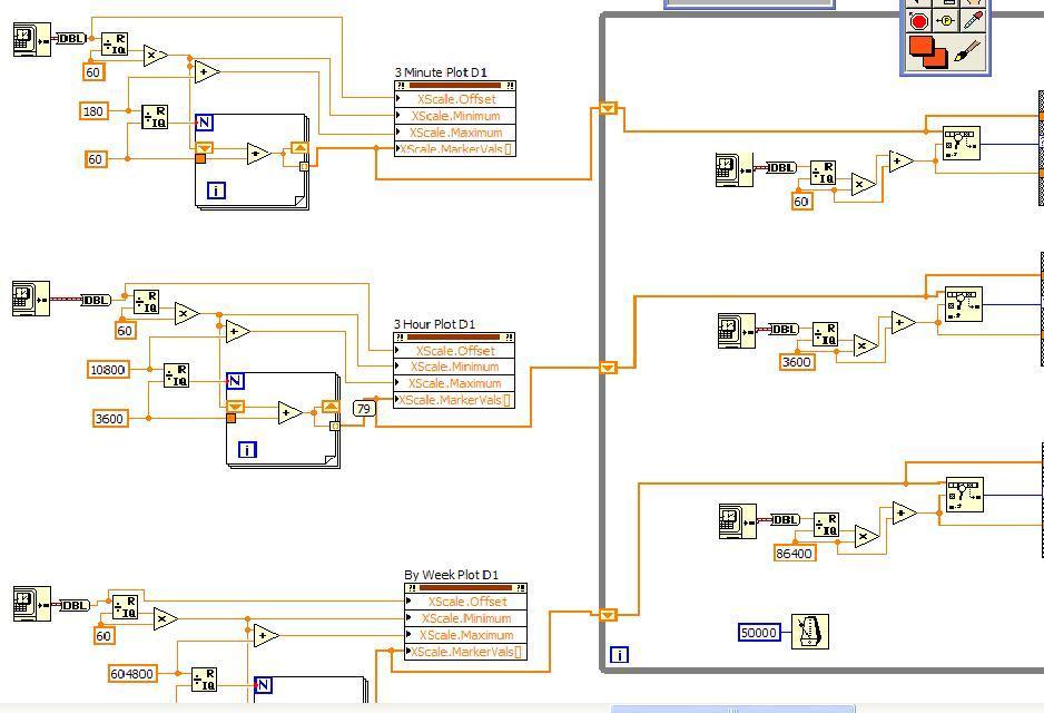
1) The 1st picture is from your VI ,"JH_waveform_graph_markers[1].vi
I have circled the divisor, "60" in the picture.
Should this number, 60, be changed based on whether Im using markers for minutes, hours, or days?
I have the divisor set at "60" for my minute chart, "3600" for my hour interval chart and "86400" for my day interval chart
Would these numbers be correct? (see "Waveform Chart Grid Markers.JPG")
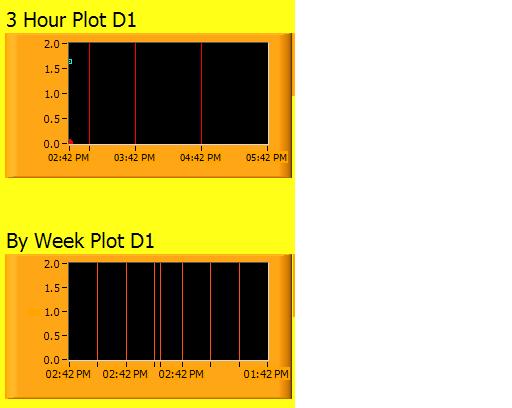
2) Using "3600" for hour interval and "86400" for the week chart, Im getting "some extra grid markers" on these charts... (see "waveform chart_extra grid lines.JPG")
Can you tell me why?
thanks
J
My entire grid marker code is attached...
-
2 Question Scott:
1) The 1st picture is from your VI ,"JH_waveform_graph_markers[1].vi
I have circled the divisor, "60" in the picture.
Should this number, 60, be changed based on whether Im using markers for minutes, hours, or days?
I have the divisor set at "60" for my minute chart, "3600" for my hour interval chart and "86400" for my day interval chart
Would these numbers be correct? (see "Waveform Chart Grid Markers.JPG")
2) Using "3600" for hour interval and "86400" for the week chart, Im getting "some extra grid markers" on these charts... (see "waveform chart_extra grid lines.JPG")
Can you tell me why?
thanks
J
-
Sorry, here it is in 8.5
Did you intend to post an attached VI? If so, it's missing.
With The attachment "doesnt work with chart_" .vi , Im trying to convert to a 3 hour graph (1 hr intervals) and also a 1week graph with 1 day intervals
-
J,
There are two problems with the example code:
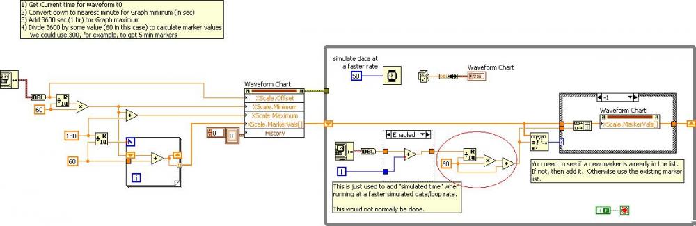
1) The major problem is you were running at a faster loop rate (generating simulated data) than the actual time was changing, Therefore the chart was scrolling faster than new marker lines were being added. The modified VI below adds some "simulated time" to account for this. If you ran your original at a normal rate, it would look to work ok.
2) You keep adding data to the markers array, but it is mostlyd uplicate data. You are growing a larger and larger array. Eventually, all this array data and large marker list will at some point start to hurt the performance of your app. I have modified it to only add a new marker when it doesn't already exist in the list. This marker array will still grow unlimited, but at least it won't have duplicate data. You could further modify it it to have a limited number of markers in the array, say 60, by removing old markers when adding new markers.
-Scott
Hey Scott
I couldnt open that last example, Im using 8.5.1
Also this new code I wrote doesnt work with a Waveform Chart, but it works with your Waveform Graph.
I tried to modify your code to give me a 3 hour time span on the X-axis with 1 hr markers.
Do you know why it works correctly in the Graph but not the Chart?
J
-
Scott
I thought I had my Waveform chart plotting grid markers correctly at 1 min intervals, BUT it the chart stops printing grid lines during its run.
I attached an example piece of code hat shows my code. When the code is run, you will see the grid lines stop being plotted..do you know why?
thanks
J
-
Scott
Can the same concept be used for a Waveform Chart?
I tried to get it to work with a Chart, but it not going well ...
Can you tell me what Im doing wrong?
J
-
I don't agree with your statements or I'm reading too much into them. I think we need to establish whether you are wanting to use relative time or absolute time on your x-axis. Using "2:00pm, 2:01pm, etc." in your first post makes me think you want absolute time. But the general statements that every 15th point should match up with a 1 minute marker make me think relative time.
1) If you use absolute time, every 15th point (starting from 0) will not necessarily cross a 1 min mark. It all depends on when you get your first point. If your first point is at 2:00:16pm then the 15th point will be at 2:01:16pm. The 11th, 26th, 41st, and every subsequent 15 points will cross at 1 min marks.
2) If you use relative time, then every 15th point (0th, 15th, 30th, etc.) will fall on a minute marker, but you won't have the actual time of day on the axis. It will just be elapsed time from the start of your app.
I'm going to assume you want #1 and that I'm just being obtuse and reading too much into your description. I've attached an example that will show this with a waveform graph. Again, for me, charts are too finnicky and limiting to deal with, at least in this instance.
Let me know if this gets you closer still...
-Scott
Thanks Scott
This seems to be what I was looking for! Yes, of course, each minute is designated from the absolute time of the previous minute (or start minute)... 2:01pm 2:02pm were just for illustration purposes.
Will your graph continue to scroll to the right as the data & time fill the first page?
I will need the X scale markers to continue indefinitely until the test is manually stopped.
Thanks
J
-
Hello Scott
this is getting closer...what I really want is the 4s data points to move across the graph while the Time intervals on the X-Axis remain fixed.
Example : If my scan rate is 4s/ sec, the 15th data point should always cross a 1min interval line on the graph in real time.....
So the X-axis may be like this 2:00pm 2:01pm, 2:02pm 2:03pm, etc and the 15 th data point should always match up with a 1min marker
I hope Im explaining this better...
J
Here is a picture of my Waveform Chart Im currently using...all I need is 1min intervals on the X axis.
And the 1min intervals should be crossed in real time about every 15th data point
(since my scan rate is 1 sample/ 4sec)
thanks
J
-
J,
They're not being set properly because you are stripping the time info by combining the waveform into the array of random numbers. The waveform is being cast to just data without any timing info. Your net result is you have a 3 element array with no timing info, so on the graph it just shows 12/31/1903 (default "0" time for LabVIEW) and never increases.
I'm attaching a reworked VI that shows the progression of going from A) where your're trying to start from to B) where I think you're wanting to go.
It has 2 loops in it. Loop 1 is where you were trying to start but getting confused. Loop 2 is a rudimentary implementation of what I believe you want. I have included comments in the VI to help you out a little.
Digest that for a bit and see if that helps and what additional questions it prompts.
-Scott
As an aside defualt "0" time in LabVIEW is actually 12:00:00 AM 1/1/1904 UTC, but your time may be a little different based on your time zone.
Hello Scott
this is getting closer...what I really want is the 4s data points to move across the graph while the Time intervals on the X-Axis remain fixed.
Example : If my scan rate is 4s/ sec, the 15th data point should always cross a 1min interval line on the graph in real time.....
So the X-axis may be like this 2:00pm 2:01pm, 2:02pm 2:03pm, etc and the 15 th data point should always match up with a 1min marker
I hope Im explaining this better...
J
-
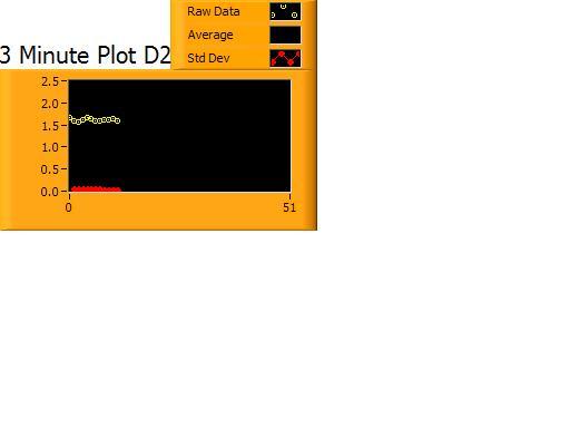
Here is my attempt at the Waveform Graph
Im trying to set 1 min intervals on the X-axis
I will have 3 pieces of data average, std deviation, and Time
My 1min intervals are not being set by the graph properly
Any reason why?
-
Here is my application...
I have data acquisition system that acquires a data point once every 4 seconds.
My Waveform Chart accurately displays my data points on the Y- axis.
What Im trying to do is format the X-axis to show the user an accurate time stamp. I have 3 charts....by minute, by hour, by week.
I would like to show the 1min chart X-axis in real 1minute intervals...starting from the start of the application
I would like to show the 1hr chart X-axis in 1 hour intervals
I would like to show the 1 chart graph X-axis in 1 week intervals.
I want to use the chart properties i.e. XScale-Multiplier, XScale-Offset, XScale- Minimum, XScale-Maximum
How do I use the properties to build the X-Axis for each chart?
~J
-
Ok Scott
Here is my application...
I have data acquisition system that acquires a data point once every 4 seconds.
My Waveform Chart accurately displays my data points on the Y- axis.
What Im trying to do is format the X-axis to show the user an accurate time stamp. I have 3 charts....by minute, by hour, by week.
I would like to show the 1min chart X-axis in 1minute intervals
I would like to show the 1hr chart X-axis in 1 hour intervals
I would like to show the 1 chart graph X-axis in 1 week intervals.
I want to use the chart properties i.e. XScale-Multiplier, XScale-Offset, XScale- Minimum, XScale-Maximum
How do I use the properties to build the X-Axis for each chart?
~J
-
Hello
Is there a way for me to have a user click on point within a Waveform Chart and display its Time and Date info?
thanks
J
-
Hello All
I have a Waveform Chart that displays my data points as my test is running.
What I need to do is have the chart store the times associated with each plotted value.
Example 1: If the chart is running, I'd like to use the scrollbar/ graph pallete to rewind the chart and tell me what time/data in chart history did each data point occur.
Example 2: If I found a defective point in an over the weekend test, I would like to scroll back thru the chart data to that point and see the time/ date it occured
Can anyone help me with this Waveform Chart scenario? Im using LV 8.5.1
thanks!!!
J
-
Found a better way to add a line/bar to the Waveform Chart at a specified interval....
Add a plot in the legend you want to use as your Interval line symbol...and give it a color
Then right click on its Chart legend & choose the plot to be a "Bar Plot" from the 2nd row of choices (any one that looks like a bar graph)
In the "Fill BaseLine" option choose -Infinity , (minus infinity) for the plot.
In your code, find where your interval counter ends.
You will then wire your plots to a cluster, then to the Waveform Chart.
Example:
In my app, I had a 3 plots of single Data wired to a 3 position cluster, then to the Waveform Chart.
Before the interval expires:
Plot 1 is my "Interval Line", I gave it a value of "-2" .....initially so it doesnt appear on the chart.
I Let Plots 2 & 3 be their real time values
After the interval expires:
Create another cluster with the same plots wired to a Waveform Chart Local Variable
Now for Plot 1, set it to some +positive value, e.g. "3" ( value of "3" , really means amplitude of "3" to the Waveform chart).
Plots 2 & 3, I gave them negative values to not appear on my graph. So when the interval expires, you will only see a straight bar with amplitude of "3"....appearing like a separator "line"
The "3" is arbitrary...just set it at some value appear to look like a line on your chart....also my scale strarts a "0"...no negative #'s are shown
-
Hey Ben
Your examples are a little different...I don't need to space each marker line by a specific length.
I have time stamps on each of my x scale grid lines
I want to ADD a specific grid line for each 60sec interval.......as a visual reference during the test
Maybe this "added" grid line would be red in color to distinguish it from the time stamp grid lines (yellow)
I have attached an example with my time stamp grid lines (yellow)...now I just want to ADD a vertical marker (red) where the time expires.
J
I just winded up making a reference with a point transition on my graph....it serves the purpose thanks for your help though
-
Hello
I am using a Waveform Chart and I would like to assign a 24 hr period on the X axis.
That would be (24) 1 hour intervals on each X axis grid line..... e.g. 12:00am,1:00am,2:00am....24:00
The start of the X axis should be the present hour. I have the grid lines turned ON
Can someone help me with this?
thanks
J
-
Hello
I would like to know how to assign 1 hour intervals to each of my grid lines (x axis) while using a Waveform Chart.
So, while my test is charting data, I would like each of my "major grid lines" to show the time by 1 hour intervals.
I have attached a sample of what Im trying to accomplish.
thanks
J
-
These threads on the Dark-Side may help.
http://forums.ni.com...=394132#M394132
http://forums.ni.com...=434723#M434723
Ben
Hey Ben
Your examples are a little different...I don't need to space each marker line by a specific length.
I have time stamps on each of my x scale grid lines
I want to ADD a specific grid line for each 60sec interval.......as a visual reference during the test
Maybe this "added" grid line would be red in color to distinguish it from the time stamp grid lines (yellow)
I have attached an example with my time stamp grid lines (yellow)...now I just want to ADD a vertical marker (red) where the time expires.
J
how do I add a marker to the graph at the expiration time.vi
-
Yes, Ive tried that method.
Problem is I need an example of how its supposed to be used. I couldnt get that to work.
I would need a picture or a VI
Im using LV 8.5.1
J
-
Hello
I am using a Waveform Chart with LV 8.5.1
At each 1 minute interval, I would like to add a vertical line to the Waveform Chart.
Does anyone know how to do this?
thanks
LV 8.5.1
J
-
lol ...thanks guys.
I think I can get it from here....
J
-
I think I see.
Like this?
Yes..like that . How did you get the time stamps on the grid lines???
I want to make sure each gets a time stamp
thanks
J
-
This is not quite what I was looking for
To add "Major Grid LInes" you have to go to the properties of the graph -->Scales--> Grid Lines and turn on Major Grid Lines
Once the Grid Lines are seen, I want to add a time stamp to THESE lines.
I have attached an example that shows the Grid LInes (yellow vertical lines).
But I want to know how to add a timestamp to each passing Yellow Grid Line and the application is running.
thanks
J


How do I create fixed X-Axis intervals using Chart Properties?
in LabVIEW General
Posted
Hey guys
Im almost done with my application, but Im noticing something with timing.
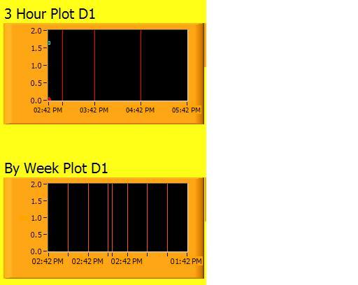
My 1 hour chart markers are not keeping pace with the PC clock.
This chart plots 1 point every 1 minute....so 60 points = 1 hour
I ran my app over the weekend.... I came into work today at 8:00am, but my application's latest marker was at 5:38am?
Im still not deleting markers yet. I'm not sure when to delete previous markers or how many markers to delete?
Ihave attached the code I use to generate chart markers.
J
Chart Markers Dont Keep up with PC Time.vi