SlavisaG
-
Posts
1 -
Joined
-
Last visited
SlavisaG's Achievements
")
Newbie (1/14)
0
Reputation
-
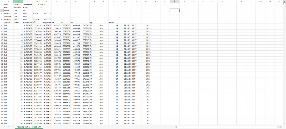
Hi, I need to plot some old data to graphs, but having some problems with it. I have some force sensor readings that I have to plot again, and I'm facing some problems, as my data doesn't corespond to my findings before. Need to use correct time stamp, so was thinking of using XY graph (or should I be using just waveform), as my reading were taken in defined time intervals. In general I have to get the X as time that has been saved in spreadsheet, and Y axis should be the forces and torques that were saved. Need a bit of help how to construct this properly and make it usefull for other readings. And one thing more, is there a posibility to change the sampling rate within the graph itself? Thanks in advance.