Search the Community
Showing results for tags 'dimension'.
-
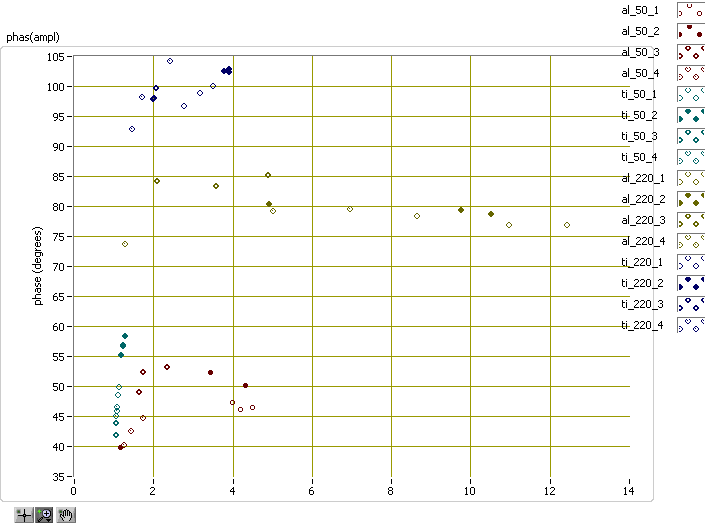
Here is a graph I made recently, which shows particle number (symbol), material (broad color family), measurement location (exact color), amplitude (X axis) and phase (Y axis). That's five dimensions in a 2D graph! There are some obvious limitations. For instance, there are only 16 symbols, so whatever you're representing by choice of symbol better not have more than 16 categories. And there are only so many colors, especially if you want them all to be ordered in a spectrum from red to violet. It gets worse when you try to have "broad color family" like I do here with reddish colors for aluminum and bluish for titanium, because the obvious logical thing to do is to skip over some shades in between the families, reducing the total number of available colors. What other options should I consider? How do you do it? I don't usually use 3D graphs because (a) they're harder to work with and (b) when I create a report for management, they like to have 2D images they can print out, or view without needing Labview on their computer. I'm attaching two VIs I use to create color spectra for my graphs. I use colors_darken_lighten to darken plots for a white background. To skip over colors, I obtained 6 colors in my spectrum and reshaped the array to two-by-three, then indexed by measurement location to get the first two colors from each broad color family. colors_darken_lighten.vi plot_color_spectrum.vi


