Lipko
-
Posts
110 -
Joined
-
Last visited
-
Days Won
1
2 Followers


Lipko's Achievements
")


-
Where do y'all get your (free) artwork for UI elements?
Lipko replied to David Boyd's topic in User Interface
Sometimes a text is better than an icon. In your case coming up with a descriptive icon is quite tricky and the words would be also short, so maybe better to use words. Anyway: I use paint in many cases and design my own icons. It's a nice way to get away from coding a bit. -
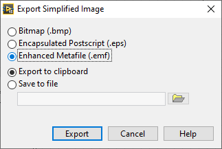
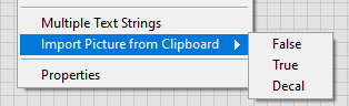
Sad. But: if you have a picture control and draw stuff in it, export the image as .emf to clipboard, then import it to the control state, it works. The image is vector image, so it will look good when printing.

-
Loosely related: is it possible with some hack to copypaste more decorations to a boolen control true or false state?
-
Thanks for the comment and also the info about the GDI thing. I have a small issue with dashed lines appearing solid or very dense when printing (yes, I use the printer method) also present in DiAdem, and I will research if it's also related to GDI. Edit: no, it's the printer that's causing the linestyle issue.
-
Thats very nice, thank you! (there a typo: 3D valves should be 2D valves.)
-
Hmm, that print to PDF method is pretty amazing, I wonder why it seems so unfinished (rotated texts become bitmaps, overlapping things may or may not become bitmaps, etc) So: maybe everybody already knew that, but picture controls are actually vector based. Lines are pretty, smoth vector lines, texts are texts that will be selectable in the pdf, etc. I'm shocked....
-
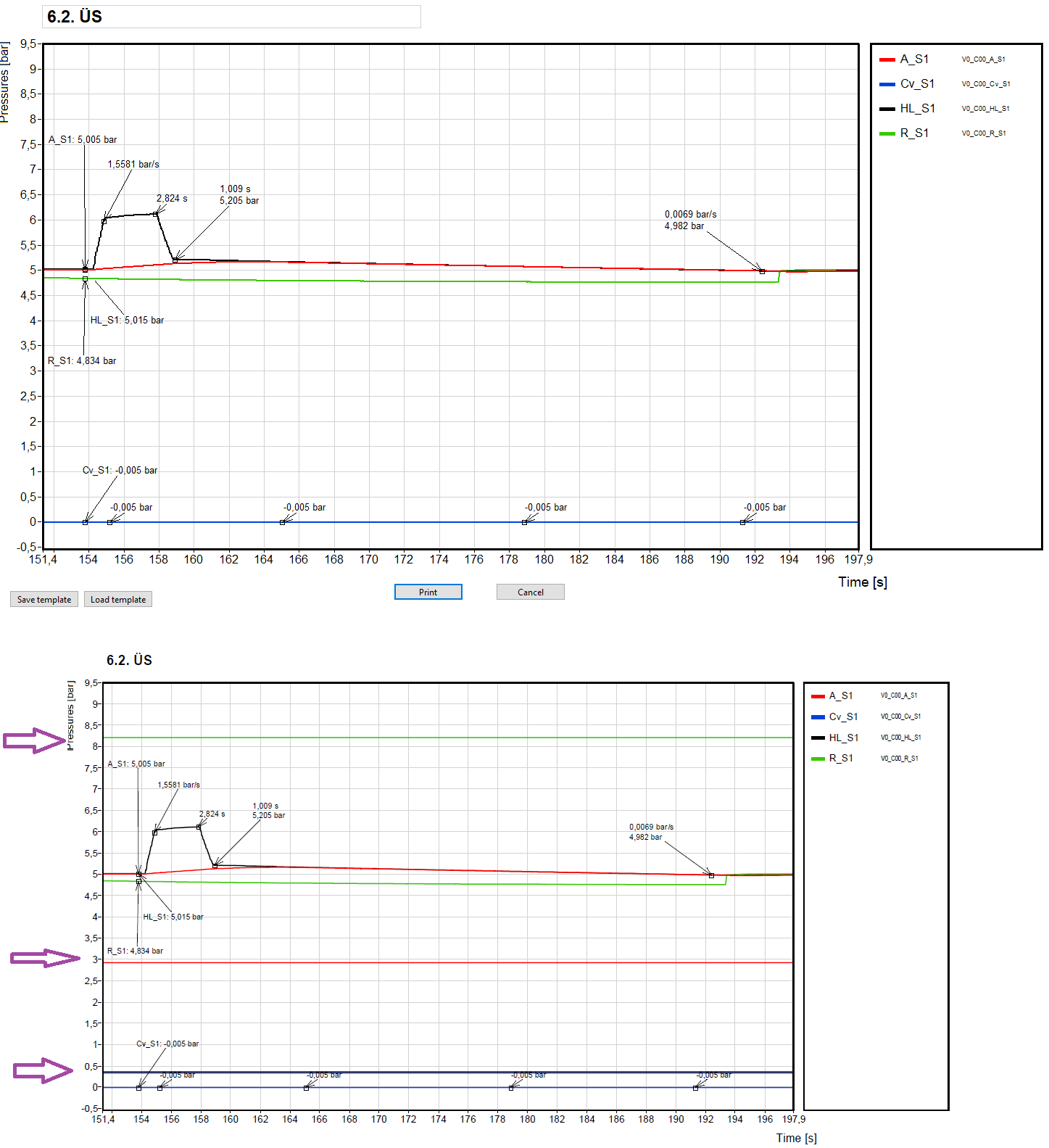
Okay, I made an easy fix, I wonder if this thing will occur again. So: simply keep only the curve data that's inside the x scale range.
-
Hi all! I started using the panel to printer method because I needed high quality pdf output of the front panel. It works okay apart from rotated strings, but I encountered a strange and pretty bad artefact. I have a graph on the front panel, and under some circumstances, "constant" lines appear on the graph in the generated pdf, see picture below (top: the front panel that is to be printed, bottom: the generated pdf). On the front panel itself, I don't see anything strange, no artefacts on the graph. This happens about 2 times per 15 prints. The graph data and everything is always the same, the only difference is the X scale range. I can set a range when the artefact wanishes. For the example below, there's no artefact with X scale set to 150... 210. I don't know where I could screw up and what, or is it a known bug (2015 sp1)? If it's a known bug, is there a workaround? Thanks for any hints in advance!
-
Double word HEX number in ASCII string problem
Lipko replied to Lucky--Luka's topic in LabVIEW General
The problem is not clear to me. You want to parse the string or do something else with it? Why wouldn't a simple scan from string work? Or do you want to forward the message? How fast should it be? -
Some noise is good to prevent overtraining. People recieve lots of random info and intelligent people still can get around. We have reached the point that God only knows how the info is digested by this AI thing. (for example a user asks something and the AI can google some interesting new keywords it didn't encounter much yet. The info it reads from the web is added to the pool...)
-
The parrot is improving with every quiestion. I can only guess how many millions of questions it gets every day. So 1-2 months can mean eons. Or maybe I just fell for all those alarmists...
-
Eons have passed since the last reply. Any new experiences? I just had GPT make me some C code calculating geomerty stuff and it did well (not a perfectly full implementation but the harder parts worked fine, saved me an hour or two). But it surely doesn't know what Lego Technic is. Um.. that was last week, maybe it has improved in the topic.
-
The sampling frequency must be at least twice the signal frequency that you want to measure. But it's better to have higher sampling that. https://en.wikipedia.org/wiki/Nyquist_frequency If it was obvious, then sorry.
-
The result of one "Select" should be the false input of the other "Select". The order should not matter.
-
Merging graph legends or selectively hiding legends.
Lipko replied to Mahbod Morshedi's topic in LabVIEW General
If you don't want the user to change plot styles/point styles etc, only the color and the label, than you could also use an array of clusters with the color, label and visibility settings. Or anything else you want, like highlighting one or more curves (thicker line).