Search the Community
Showing results for tags 'nxg'.
-
As seen in the other thread, I am pretty negative about NXG. However I would like to temper this with some things I have seen in NXG which I do like Vector based GUI. I don't like the choice of colours, fonts, widgets or pretty much any of the iconography but I do think the switch to vectors is an absolute necessity for a modern application running in high DPI settings. Zoom! I was pleasantly surprised when I accidentally zoomed on the Front Panel. In current gen to get pixel perfect GUIs sometime I find myself resorting to the windows magnifier or dropping down to 1024x768, so being able to zoom is a welcome addition. The helper alignment hints when placing Front Panel controls. Anyone who has used any kind of vector drawing application in the last 5 years will be immediately familiar here. (I am not sure why this is not done when designing a typedef though). The placeholder location for controls and terminals when dropped from the "other" view. No more weird and random location for new controls and terminals! WebVIs. The WebModule is not ready for any heavy lifting, but for basic web pages it currently does the trick. As a LabVIEW developer I really do not want to ever have to learn JS or HTML5 and WebVIs are certainly many steps in this direction (now please port this to current gen!). Now that I know what I am doing I guess I could start from nothing and put together a simple web VI that communicates with something else via a REST API in a couple of hours. The build process turns the VI into a bunch of HTML and JS which you can serve up with any web server. This technology has potential! The panel on the right hand side which can stay open and give you quick access to the properties of controls. It currently pretty ugly and unfriendly to usability with all its greyness, but the concept is quite sound. It can be hidden away when not needed. I am so used to the current gen properties window that it takes me a while to find anything but I expect that to diminish with more use. The icon editor. The default size of the glyphs is much too large but in general this pane gets the job done. At a glance I can see the association of all the terminals. I am not so keen at having Inputs and Outputs as submenu items as this just slows things down a bit, but the concept of showing the user the "direction" of the control is welcome. I have not really used it to create banners and stuff like that yet so I cannot comment too much on that UX. The Build Queue lists about 10 of the last builds which although I did not need in my experimental project I can see how this might be useful. If the build version number could be included in the table this would be most welcome. These bottom pane things can all be collapsed away when not needed which is good. That is about it. My experiment only involved creating a WebVI, so it is possible I have missed some neat things that can be done when developing a traditional desktop application. Does anybody have any others to add to this list?
-
If you use Variant handling using the Variant Parsing Library, or use any library that does, please see this conversation, where I learned from AQ that the name in a Variant is never to be supported in NXG, eliminating all sorts of advanced capability.
-
Hi wire-heads, Have any of you started using LabVIEW NXG for real projects? How finished and stable do you find it? Also, do you find that it can successfully co-exist with LabVIEW 2015-2017 on the same development machine? Thanks very much. -Joe
-
I have to admit I've never gotten to use the state-chart module on a project, but I've always wanted too. I really enjoyed it when i evaluated it, but i worry it wont be available to nxg users... ever. Of course I can hope that it will be re-tooled and better than ever on nxg. What do you guys think will happen?
-
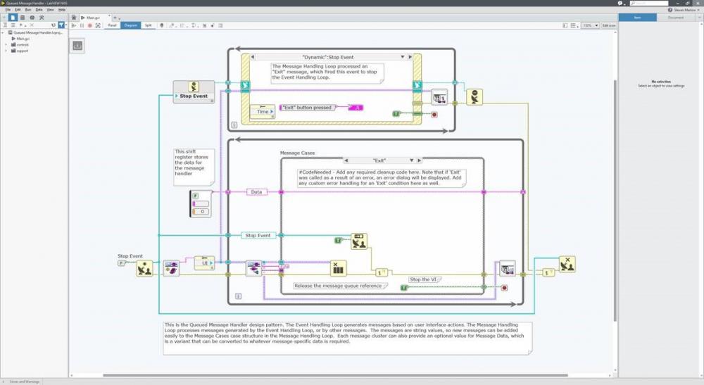
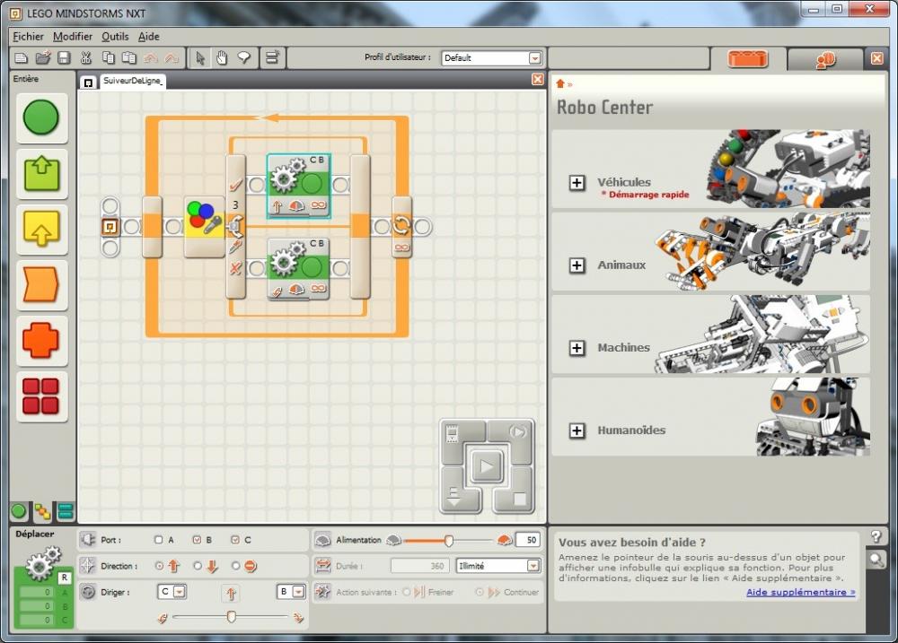
I just downloaded and installed LabVIEW NXG. At first I thought I installed LEGO NXT by mistake... All kidding aside, I am just now poking around to see what is there, and there are definitely some things to be thankful for. Other things...not so much. Extremely radical changes to the graphics on the palettes and root functions, along with major palette restructuring. Looks like navigation by sight will have to be learned all over again. I will post more thoughts on this thread when I get the chance. Oh, and manual tool selection is gone, along with the tools palette, if I am not mistaken.


