Leaderboard


Popular Content
Showing content with the highest reputation on 03/11/2022 in all areas
-
Here are a bunch of other web resources for colors & UI Design: Data Visualization Since LabVIEW tends to get used a lot in industrial, scientific, and academic settings, it's pretty common that we need to display data in a clear & understandable way. There are a bunch of resources for picking color schemes to represent data to improve contrast, readability, and accessibility (such as colorblind safe palette). Color Brewer: A useful website with a variety of color schemes for displaying data. Has options for sequential datasets, diverging, and qualitative. As well, it shows whether the selected color set is colorblind friendly, print friendly, or photocopy friendly. matplotlib colourmaps: Technically a python resource, but colors are colors. matplotlib is one of the most widely used python libraries for data visualization in python, and they've put a ton of effort into designing good color schemes. There's another library called seaborn that is based on matplotlib that has some more color palettes. Tristen's HCL Picker: A color palette picker which lets you choose colors that are evenly spaced in hue, chroma, or in lightness. This tool is really useful for generating palettes with good contrast. Fundamentals of Data Visualization: A book with lots of useful information on data visualization, from colors to plot styles and more. Design Palettes Making data readable isn't the only thing that matters, sometimes you want to have pretty UIs too. Some handy resources are: Adobe Color Tools: Has a color wheel for designing your own palettes. A tool to extract color themes & gradients from an image (drag/drop a clients logo in there to get a palette based on their company colors), and a tool for checking color contrast for readability. coolors.co: A website with a ton of color palettes to pick from. Material Design Color System: Material Design is primarily meant for mobile & web apps, but the design principles can apply to any application really. The Material Design guidelines have good tips on making intuitive UIs, and provides a palette of nice looking colors. Material Design Palette: To go along with the above. Select your primary & accent colors, and this website returns a palette. colormind.io: A neat website that procedurally generates color palettes. Lock in one or two colors and let the website pick the rest of the palette. mycolor.space: Similar to colormind.io, this auto-generates a palette. ColorSpace takes in a single color and returns several matching palettes. Icons Lastly, good icons can be a great finishing touch. Maybe it's just because I've been using LabVIEW for so long, but I find LabVIEWs icons to be a bit dated. Material Design Icons: A website with a ton of free icons, able to be downloaded as pngs. Adds a nice touch to UI elements. FontAwesome: Has about 1700 free icons. With a subscription, has almost 15k. icons8: Has something like 875,000 icons. Free to use as long as you credit & link to icons8 in an 'About' page.2 points
-
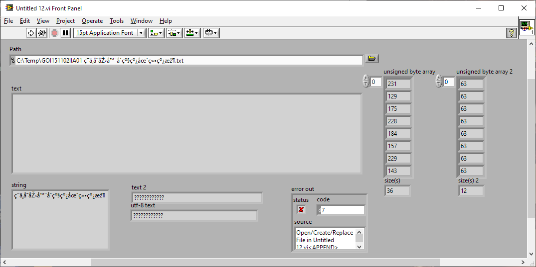
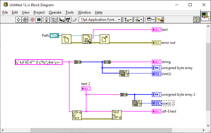
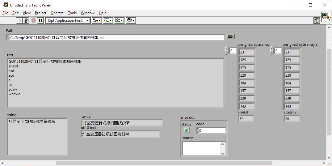
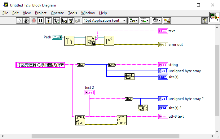
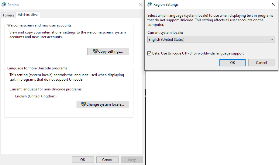
Just to side-track the whinging completely (most of it mine ) and to show that it's not as hard as NI make it out to be; this will get you about 80% of the way with UTF8 (UTF8 FTW) on English Windows systems. Note that the Windows ANSI functions - the underlying calls for the LabVIEW primitives - do notionally support UTF8. Rolf can give a much better explanation of why this works (Codepages) and the pitfalls of using it. There is no change to the VI, by the way. It is just changing the setting and restarting the OS. utf8.zip
 1 point
 -
The problem with that talk is that it says nothing about what the stated goals of NXG were, why the progresses were so slow, what their roadmap looked like at the time they canned it, and what their plans are for the future. Instead, there was a mention of their audit by a bunch of Agile zealots, a free advertisement for online post-it boards and other kind of nonsense about why the lessons they learned (essentially regurgitated slogans) should be taken very seriously by the audience (no kidding). And then there was the now infamous series of botched polls and Q & As which of course they have diligently ignored ever since. Not that it departs much from what the scripted presentations at NI week used to be (at least the few I watched online) so it shouldn't have been a surprise that it would end up that way. I am ahoping that those really interested in actual facts managed to ask him those questions later on (if so, please tell us). In my world (academia), the most important bits are gathered that way, by post=presentation discussions. If your format doesn't constrain presenters to be around during the whole series and be available for discussions, this calls for changes. This being said, thanks for posting those presentations!1 point
-
This is pertinent to the discussion on Unicode, but more related to the meme - https://www.joelonsoftware.com/2003/10/08/the-absolute-minimum-every-software-developer-absolutely-positively-must-know-about-unicode-and-character-sets-no-excuses/1 point