Search the Community
Showing results for tags 'graph'.
-
The bug has been described a while ago here but might never have been submitted... It is still present in LV 2021 SP1.
-
I can very repeatedly hang LabVIEW 2017 without even running a VI. It involves simply changing the y-scale mapping on a graph to be logarithmic. The best I can tell is that the initial (linear) scaling has the same max/min range values and this causes the problem somehow. Does this happen in other versions of LabVIEW? (I'm using 17.0.1.f4, 64-bit.) And more importantly, how can I avoid this issue if I want to use log scaling and the data may start with a bunch of identical (positive-definite) values? I'm using the "XY Graph (silver)" control. I haven't yet replicated the problem with the standard "XY Graph" control, either because I haven't created the right conditions or because that control doesn't have the issue. But I'd like to avoid switching out all my (many) graphs, in any case. CrashDemo.vi
-
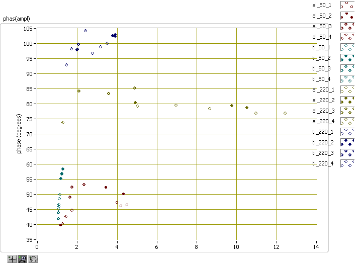
Here is a graph I made recently, which shows particle number (symbol), material (broad color family), measurement location (exact color), amplitude (X axis) and phase (Y axis). That's five dimensions in a 2D graph! There are some obvious limitations. For instance, there are only 16 symbols, so whatever you're representing by choice of symbol better not have more than 16 categories. And there are only so many colors, especially if you want them all to be ordered in a spectrum from red to violet. It gets worse when you try to have "broad color family" like I do here with reddish colors for aluminum and bluish for titanium, because the obvious logical thing to do is to skip over some shades in between the families, reducing the total number of available colors. What other options should I consider? How do you do it? I don't usually use 3D graphs because (a) they're harder to work with and (b) when I create a report for management, they like to have 2D images they can print out, or view without needing Labview on their computer. I'm attaching two VIs I use to create color spectra for my graphs. I use colors_darken_lighten to darken plots for a white background. To skip over colors, I obtained 6 colors in my spectrum and reshaped the array to two-by-three, then indexed by measurement location to get the first two colors from each broad color family. colors_darken_lighten.vi plot_color_spectrum.vi
-
Hi, I figured people here may be more interested in this project. I have some cool graph extensions I'm building in an open source project, which make some nice graphical overlays for XY graphs and waveform graphs in LabVIEW. I've got a github page where you can grab the code, support the project or just have a look at some of the same screenshots. Everything updates live in the graph, so you really need to see it, to get how it all works, so here you go: https://github.com/unipsycho/Graph-Extensions-LabVIEW Please star follow the project if you want to see this developed and I'd appreciate any feedback or ideas to extend it further. The markers are very much IN development right now, so no where near finished, but the tools can still be seen working. THANKS!
-
Hi guys, I'm trying to programmatically update the names of five plots in a digital waveform graph. The plots are in a particular order which corresponds neatly withe the order in the legend as in the order under the "Plots" tab in the properties window. However when I try to update the Plot.Name property for each plot by stepping through the ActPlot property the order seems to be 1-2-3-4-0, i.e. when I try to change the name of ActPlot=0 it affects the last plot instead of the first. What gives? Is there any other indexing property instead of ActPlot I can use which LabVIEW uses to keep track of the plot order? I'm just updating an old vi so it would be nice if it could be solved without altering the waveform used as an input to the graph.
-
I just recently had a need for XY chart functionality in my application. The example NI has on its website was a little too simple, as I needed support for multiple curves. I've attached the VI and some examples, would love to hear any critiques you have. XYChart.zip
-
Hi, My graph is a XY Graph but the X-scale is just the time. I use the XY Graph in order to define the time stamp of each sample. I use cursors that I snap to the plots in order to display the plots' names. Everything works well when all the plots are displayed against Y-scale 0. But when switching a plot to Y-scale 1, the associated cursor keeps moving like if its plot was still on Y-scale 0. Simply dragging the cursor with the mouse a little bit snaps it to its plot properly (value displayed against Y-scale 1). I tried using the Cursor.YScale property of the cursor but it doesn't seem to help. Has any of you encounter this issue? I am using LV 2011. Thanks!
-
Hello, In matlab the plot data can be save as a *.png,*.jpeg, and so on and even a pretty good option *.fig. Later when the *.fig is opened you have the real plot as before and this can be edited like changing the legeng , x and y labels, color of the plot etc,. Is there any option like this in labVIEW. I have seen options like saving the data into excel and to different image formats. Is there any special tool kit or add in functions??
-
Hi guys, Today I'm having a new problem to troubleshoot. I'm populating a graph and I'm customizing its plots every time the user click on a button. The number of waves shown into the graphs can change on each click and the plots number depends on the number of waves selected by the user. How can I clean the exceeding number of plots previously configured when the user pass from a high number of waves to a lower number of waves? I would like to remove the exceding plots from the legend, not just clean theirs name. I hope that what I want to achive is clear. Thank you in advance.


