User Interface
Any code that enhances or manipulates the the front panel UI. Custom controls, Xcontrols, property nodes and references.
34 files
-
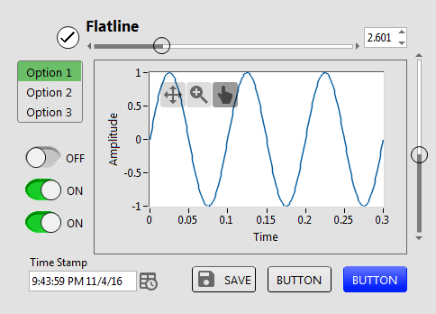
Flatline Controls
By drjdpowell
A set of custom controls, following the trend of a more flat UI design. Heavily influenced by Google’s Material Design, though constrained by what can be done with available tools and options in LabVIEW. Uses icons from Google Material Design.
— Buttons based on the system booleans (with hover effects). Icons can be added as decals (such as from materialdesignicons.com)
— Matched sets of controls for numeric/string/enum/etc., based on Silver controls, but swapping out all ‘chrome’ for simple boxes and lines.
— flattened versions of switches/sliders/arrays/graphs etc.
Now on the LabVIEW Tools Network
JDP Science Tools group on NI.com.
1,786 downloads
Updated
-
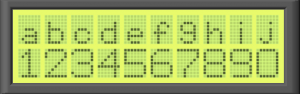
LCD panel.ctl, LCD panel.vi
By tylertroy
I've been playing around with making some controls that mimic popular electronic components and here is one of them. It's a basic 10 x 2 character LCD panel. You can play with the colors to create a variety looks. You could also imagine modifications to create animated LCD panels. Feel free to incorporate into what ever you're creating.
901 downloads
Submitted
-
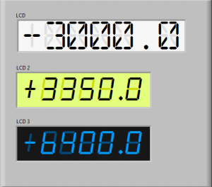
LCD1.ctl, LCD2.ctl, LCD3.ctl
By tylertroy
Here are a couple of controls that simulate an LCD numerical display. You will need to install the fonts for them to work as pictured. You can achieve the same things with which ever font you like but it really only works with mono-spaced fonts.
You can customize each control in the "Advanced" right click menu of the control to set the precision you need or to modify the font size. Note that you can't change the font size without customizing the "background" label font too. Accessing and modifying each component is most easily achieved by changing the z-order of the components using the Ctrl-K, Ctrl+J shortcuts while in tweezer mode
1,895 downloads
Submitted
-
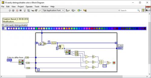
55 easily distinguishable color.vi
By Benoit
This is the only way I found how to have a bunch of color that are unique and easily distinguishable. The maximum I saw in the web was about 26. This one offer 55 of them without gray tone. You can modify this VI to support gray tone as well and goes up to 60 colors.
334 downloads
- distinguishable
- color
- (and 2 more)
Updated
-
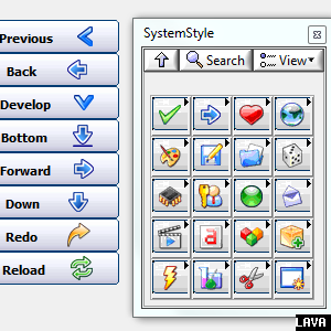
UI Tools expansion pack: System style
UI Tools Expansion pack: System Style controls v1.1.0.7
Copyright © 2009-2015, Francois Normandin. (LabVIEW code)
Copyright © 2003-2004 David Vignoni. (NUVOLA ICON THEME FOR KDE 3.x)
All rights reserved.
Author:Francois Normandin
Contact Info: Contact via PM on www.lavag.org
LabVIEW Versions:
Created with LV 2009
Dependencies:
Description:
This package contains System-style buttons with text (left-side) and icon (right-side).
Includes:
- Set of System-style controls
- Based on Nuvola icons (see attached LGPL license)
Instructions:
After installing package with VIPM, refresh palettes if VIPM is not set to refresh automatically.
Use palettes.
Known Issues:
Acknowledgements:
David Vignoni (Icon King) for the Nuvola Icon Theme
Change Log:
v1.1.0.7: Fixed palettes with "?" icons due to control name collisions
v1.1.0.6: Migrated to VIP file. Moved controls to vi.lib
v1.0.4: Removed a menu file that showed up incorrectly in the functions palette.
v1.0.3: Initial release of the code. (8.6)
License:
Distributed under the BSD license.
Nuvola icons are LGPL licensed. Keep Nuvola Icons license with distributions.
Support:
If you have any problems with this code or want to suggest features:
please go to www.lavag.org and Navigate to the discussion page.
Distribution:
This code was downloaded from the LAVA Code Repository found at www.lavag.org
============================
5,996 downloads
Updated
-
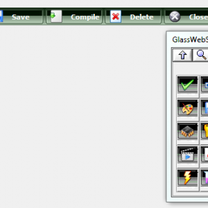
UI Tools expansion pack: GlassWeb style
UI Tools Expansion pack: GlassWeb Style controls v1.1.0.3
Copyright © 2009-2015, Francois Normandin. (.ctl files)
Copyright © 2003-2004 David Vignoni. (NUVOLA ICON THEME FOR KDE 3.x)
All rights reserved.
Author:Francois Normandin
Contact Info: Contact via PM on www.lavag.org
LabVIEW Versions:
Created with LV 2009
Dependencies:
Description:
This package contains GlassWeb-style buttons with text.
Use especially as horizontal toolbar selectors.
Includes:
- Set of GlassWeb-style controls
- Based on Nuvola icons (see attached LGPL license)
Instructions:
After installing package with VIPM, refresh palettes if VIPM is not set to refresh automatically.
Use palettes.
Known Issues:
Acknowledgements:
David Vignoni (Icon King) for the Nuvola Icon Theme
Change Log:
v1.1.0.3: Fixed palettes with "?" icons due to control name collisions
v1.1.0.2: Migrated to VIP file. Moved controls to vi.lib
v1.0.1: Removed a menu file that showed up incorrectly in the functions palette.
v1.0.0: Initial release of the code. (8.6)
License:
Distributed under the BSD license.
Nuvola icons are LGPL licensed. Keep Nuvola Icons license with distributions.
Support:
If you have any problems with this code or want to suggest features:
please go to www.lavag.org and Navigate to the discussion page.
Distribution:
This code was downloaded from the LAVA Code Repository found at www.lavag.org
============================
5,028 downloads
Updated
-
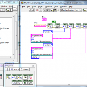
UI Tools addon: Tree & Tagging
UI Tools Tree OOP Add-On v1.0.4
Copyright © 2009-2010, François Normandin
All rights reserved.
Author:François Normandin
Contact Info: Contact via PM on www.lavag.org
LabVIEW Versions:
Created and tested with LabVIEW 8.6
Dependencies:
lava_lib_ui_tools >=1.0.36
Description:
This package contains classes for manipulating Trees with some enhanced features.
It consists of a set of VIs to create tree objects and associating tags with data in a variant format.
Includes:
- includes some icons from FamFamFam (see license in _Symbols directory) for demo purposes. You do not need these icons if you use the Tree OOP classes in your work.
Instructions:
After installing package with VIPM, refresh palettes if VIPM is not set to refresh automatically.
You will find the palettes in the UI Tools functions palette (user.lib)
Known Issues:
- No drag and drop functionalities included. You'll have to do that on your own if wanted. (for now anyway)
- Arrays will be shown has a succession of Unnamed items. Recursive VI provides a way to put it on
a single line within brackets, but has been removed to provide backward compatibility to 8.6. An add-on
will be posted for LV 9.0+ users.
- The Children & Parents Symbols synchronization works only for Symbol indexes 1-2-3 (True-False-Mixed).
- When adding an item on the same level as an existing one, it gets added in front. Expected behavior would
be to have it added afterwards.
- Modifying a child's data does not recursively modify the parents' data (cluster variants). This will
become obvious once you try the framework... This functionality will be kept in my mind for future improvements.
Acknowledgements:
Norm Kirchner from which I got some tricks in his Tree API (see LAVAG.ORG)
Change Log:
v1.0.4: Solved problems with hardcoded path for symbols installation. Affected primarily installations on 32-bit
Windows systems.
v1.0.3: Initial release of the code. (LV 8.6)
License:
Distributed under the BSD license.
Support:
If you have any problems with this code or want to suggest features:
please go to www.lavag.org and Navigate to the discussion page.
Distribution:
This code was downloaded from the LAVA Code Repository found at www.lavag.org
============================
4,708 downloads
Updated
-
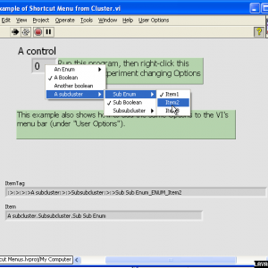
Shortcut Menu from Cluster
By drjdpowell
A pair of subVIs for connecting a cluster of enums and booleans to a set of options in a menu (either the right-click shortcut menu on control or the VI menu bar). Adding new menu options requires only dropping a new boolean or enum in the cluster.
See original conversation here.
I use this heavily in User Interfaces, with display options being accessed via the shortcut menus of graphs, tables, and listboxes, rather than being independent controls on the Front Panel.
Relies on the OpenG LabVIEW Data Library.
774 downloads
Updated
-
Toolbar Class
By hooovahh
Toolbar Class
Copyright © 2014, Brian Hoover (hooovahh)
Author:
Brian Hoover (hooovahh)
Environment Support:
LabVIEW 2011 and up
Windows only (likely XP and newer) due to .NET dependency
Description:
This is a toolbar class designed to make toolbars in the UI, which appear more like normal toolbars seen in Windows.
The idea for this came about because I wanted a way to make a simple toolbar, but didn't want to have to make all the button states for mouse not over, mouse over, mouse down. I just wanted to provide one PNG file for a button, and have it take care of how the button should look.
I also wanted a way to handle when there are more buttons than there is room for horizontally. When this happens I wanted a More Options button to appear which when clicked gives a vertical list of the remaining buttons, and a veritcial scrollbar if there are too many buttons to show vertically.
I also wanted support for basic veritcal and horizontal separators.
This toolbar class can do all these things, and all that is needed is to provide the buttons as PNG files with alpha layers. other file types like JPG, and BMP are supported but won't look as good just because buttons don't need to be a rectangle and can have soft edges. The Add Icon(s).vi is a polymorphic and also can add images from Image Data, or the native LabVEW picture data type. But these image types have the same issue mentioned with JPG and BMP that they don't support alpha layers.
Dependencies:
This relies on the following OpenG packages, a VIPC is included.
OpenG Error Library-4.2.0.23
OpenG Application Control Library-4.1.0.7
OpenG File Library-4.0.1.22
OpenG String Library-4.1.0.12
OpenG Array Library-4.1.1.14
OpenG LabVIEW Data Library-4.2.0.21
Installation and instructions:
At the moment this is not distributed as a package but just a zip with the required files in it. Install the OpenG packages required or install the Required Packages.vipc. Then run the Example Toolbar under the Example folder. This uses images from within the Example Images folder and must be in the same directory as the Example Toolbar.vi. There is also a Toolbar Tree.vi which shows the public functions as they could appear on the palette.
Distribution:
This code was downloaded from the LAVA Code Repository found at lavag.org
942 downloads
Submitted