Leaderboard


Popular Content
Showing content with the highest reputation on 10/22/2021 in all areas
-
What about this... https://www.jki.net/profusa?hsLang=en or this... https://www.jki.net/radx?hsLang=en or this... https://resources.jki.net/smarter_sorting or this... https://resources.jki.net/femtometrix-case-study or this... https://www.jki.net/apollo-fusion?hsLang=en or this... https://www.jki.net/kairos-power2 points
-
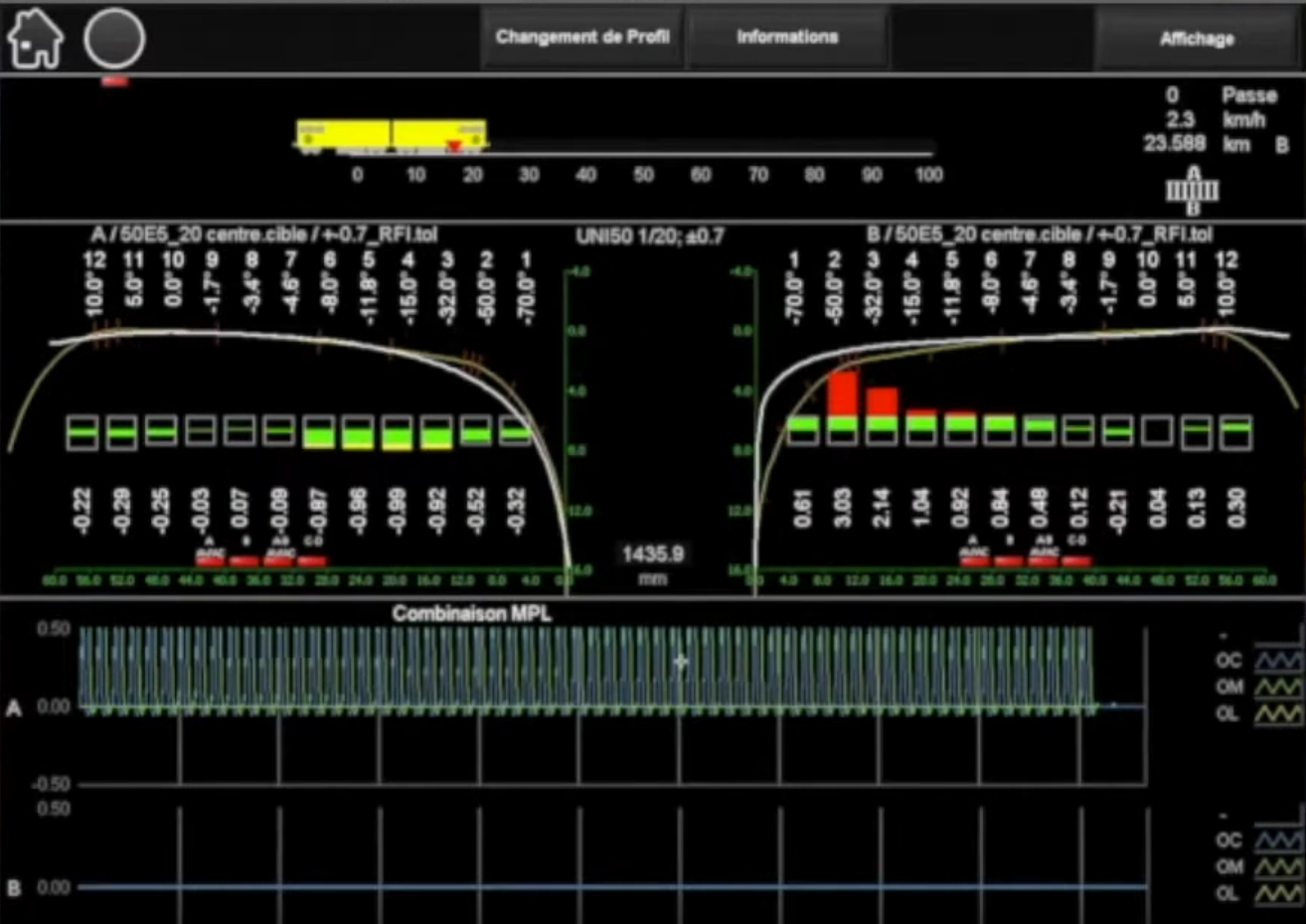
Also these custom graphs, 100% 2D picture control. The lad who did that is a ninja!
 1 point
 -
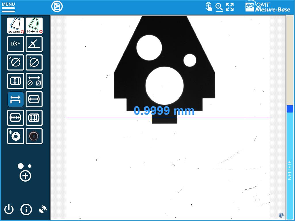
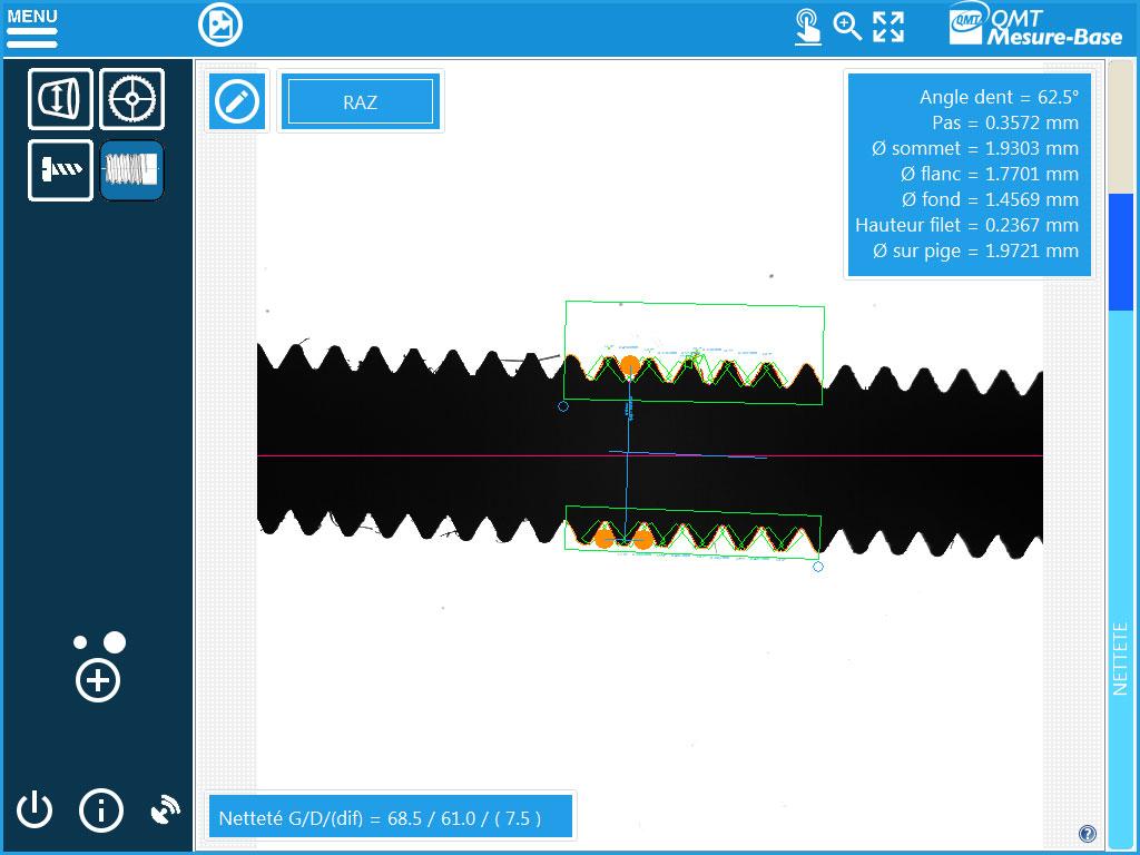
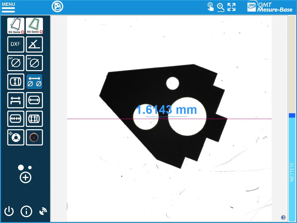
I use to work at qmt (Qualimatest), a lot of effort was spent on UI/UX
1 point
-
In the example I posted earlier there is a tab at the bottom which (seemingly) scales nicely. It is a trick though...I described it a long time ago here. Maybe someday we get this implemented.... Or better yet, anchoring.1 point
-
There's a UI User group over on the Dark Side. If you hunt through it there are a few UI's like Star Trek, Media Interfaces and iPhone simulations.1 point
-
"The software you are refactoring had one and it is too costly to change the training materials". How's that? It is likely that a great deal of pressure had to be applied to even allow a rewrite and the manager probably had a hard time arguing for a budget to do it. Getting hot under the collar over a button isn't a hill I would die on. I would concentrate of making my life easier supporting it going forward than what it looked like-which was decided a long time ago.1 point
-
Okay so I wrote some code back in the 2011 era for doing some graph stuff and never used it. As a result there are a few places that the code could take advantage of modern functions (limited events, array tunnels, conditional, and concatenating, VIMs, even Set and Maps) but in any case I have it here for others to take a look at and use as they want. I don't intend on updating this further. It all started when I found the built in graph controls to be limiting in terms of signal selection and control. I wanted a way for a user to select the signals they want and then show those on a graph with a shared time scale. The problem was at the time the checkbox selector on a graph could have a scroll that couldn't be controlled. So I started with a single column listbox showing all signals and allowing multiple to be selected. I wanted to see the current value so I added that. Scope creep kept going until I'm left with this thing that isn't done, but isn't terrible. In this demo there is a subpanel mode, independent windows, pause and resume, the normal graph palette controls, independent Y axis scaling, coloring, buffer size control, visible signals selection and values, and a few other things. It was intended to be used in places where speed and exact values weren't used. It was more or less a place where all signals of a system could be seen slowly. It uses a few things I've posted on LAVA before. My Variant Repository, Array VIMs, and Circular Buffer. Here is a video. Circular Graph.vipc1 point
-
Over on reddit someone asked for suggestions on how to make a sliding UI like you might find on your phone. I thought it was a fun challenge so here is my very rough draft that could probably be turned into a QControl. And a video. At the moment you can only change the settings of booleans and of a selection like the days of the week I show. I planned on putting code for handling string and numeric value changes but probably spent too much time on this already. Android Sliding UI Demo.zip1 point